The 13 WCAG Failures I Find on Every Enterprise Project
After auditing accessibility on large enterprise codebases, the same failures appear every time. Here's the list — with the WCAG criterion, the real impact, and the fix.
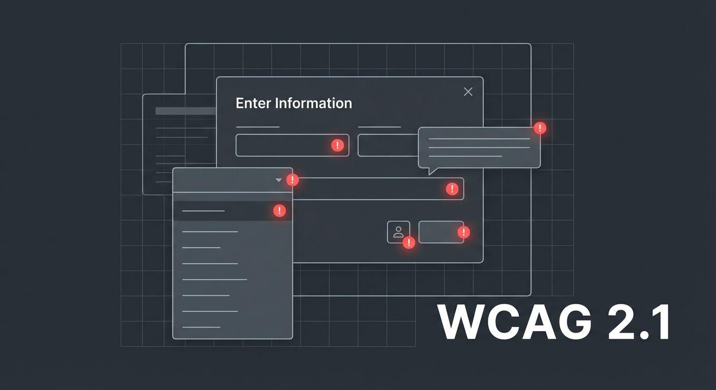
I've audited the accessibility of a lot of enterprise front-end codebases. Fortune 500 marketing sites, internal tools with thousands of daily users, SaaS products with paying customers who happen to use assistive technology. The same thirteen failures appear on nearly all of them.
These aren't exotic edge cases. They're patterns that spread because the code that introduces them looks fine in a visual review, ships without complaint, and accumulates across sprints until someone — usually an accessibility consultant, sometimes a lawyer — surfaces them all at once.
I built an interactive demo of all thirteen so you can see and test the broken version alongside the fixed version. This post is the companion text.
1. Images without meaningful alt text
WCAG SC 1.1.1 — Non-text Content (Level A)
The failure is almost never a missing alt attribute — it's a meaningless one. alt="image", alt="photo", alt="banner_homepage_final_v3.jpg". These pass automated checks and fail real users.
Decorative images should have alt="" (empty string, not omitted). Informative images need a description of what they convey, not what they look like. An image of a graph doesn't need alt="bar chart" — it needs alt="Q3 revenue increased 42% year-over-year".
2. Color as the only means of conveying information
WCAG SC 1.4.1 — Use of Color (Level A)
Red for error, green for success. Fine as a supplement. Failure when it's the only signal. Users with red-green color blindness (roughly 8% of men) see both as similar shades of brown. Add an icon, a text label, or a border style change alongside color.
3. Insufficient color contrast
WCAG SC 1.4.3 — Contrast Minimum (Level AA)
The threshold is 4.5:1 for normal text, 3:1 for large text (18pt+ or 14pt+ bold). Light gray on white is the most common failure. Secondary text, placeholder text, and disabled states are where it usually lives. Every design token color combination should be contrast-checked at the token level, not the component level.
4. No visible focus indicator
WCAG SC 2.4.7 — Focus Visible (Level AA)
outline: none on :focus without a :focus-visible replacement. The short version: design a focus style, don't remove it.
5. Interactive elements that aren't keyboard-reachable
WCAG SC 2.1.1 — Keyboard (Level A)
Custom components built on <div> or <span> with click handlers, but no tabIndex, no keyboard event handling. Users who navigate by keyboard or switch access simply can't activate them. The fix is almost always: use the right HTML element (<button>, <a>, <select>), or if you must use a custom element, add tabIndex="0" and a keydown handler.
6. Carousel and auto-playing content with no pause control
WCAG SC 2.2.2 — Pause, Stop, Hide (Level A)
Any content that moves, blinks, or auto-advances must be pausable if it lasts more than five seconds. Homepage hero carousels that cycle every three seconds with no pause button are the canonical failure. Add a pause/play control, make it keyboard-operable, and put it close to the carousel.
7. Form fields without visible labels
WCAG SC 1.3.1 — Info and Relationships (Level A) / SC 3.3.2 — Labels or Instructions (Level A)
Placeholder text is not a label. When a user starts typing, the placeholder disappears — now they don't know what the field expects. Use <label> elements, associated with for/id pairs or wrapping the input.
8. Error messages not programmatically associated with their fields
WCAG SC 3.3.1 — Error Identification (Level A)
An error message rendered as a red <p> near a field fails if it isn't linked to that field via aria-describedby. A screen reader announcing "This field is required" in the middle of a form doesn't help a user understand which field is required.
<input id="email" aria-describedby="email-error" aria-invalid="true" />
<p id="email-error" role="alert">Please enter a valid email address.</p>
9. Modals that don't trap focus
WCAG SC 2.1.2 — No Keyboard Trap (Level A) — inverted
A modal that doesn't trap focus lets keyboard users tab out of it into the obscured background content. The right behavior: trap focus within the open modal, and release it on close.
10. Missing page title or non-unique page titles
WCAG SC 2.4.2 — Page Titled (Level A)
Every page needs a descriptive <title>. In a single-page app, this means updating the title on route changes. In Next.js: use the metadata export or <title> in <head> per-route.
11. Icon-only buttons with no accessible name
WCAG SC 4.1.2 — Name, Role, Value (Level A)
A <button> containing only an SVG icon and no text has no accessible name. Screen readers announce "button" with no additional context. Fix: aria-label on the button, or visually-hidden text inside it.
12. Links that say "click here" or "read more"
WCAG SC 2.4.4 — Link Purpose in Context (Level AA)
Screen reader users often navigate by listing all links on a page. A list of "click here", "read more", "learn more" links is useless without the surrounding context. Link text should describe the destination: "Read the Q3 report" not "click here".
13. No skip navigation link
WCAG SC 2.4.1 — Bypass Blocks (Level A)
Keyboard users have to tab through every navigation item on every page load to reach the main content — unless there's a skip link. Add one at the very top of the <body>:
<a href="#main-content" class="skip-link">Skip to main content</a>
Style it to be visually hidden until focused. It's invisible to mouse users, essential to keyboard users.
The pattern underneath all thirteen
None of these failures require advanced accessibility knowledge to fix. Most require one attribute, one element swap, or one line of CSS. They're common not because they're hard, but because they're invisible in a visual review and there's no build-time check that surfaces them.
The most effective thing I've found: add axe DevTools to your browser, run it on every page before it ships, and treat the results as bugs — not suggestions.